 913-685-9477

The Problem
 Have you ever tried to read a PDF form on a smartphone?
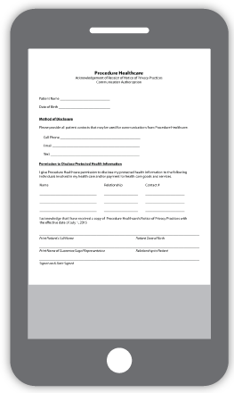
The form will be shrunk to fit the entire thing into the width of the phone, sort of like this:
Unless your patient has really good eyesight, they’re either going to have to zoom in very close (and then scroll left and right and up and down) or they’re going to give up and find a different practice’s website that they can work with.
And even if all you intended was for them to print the PDF and fill it out by hand, most smartphone or tablet users don’t always have a printer handy when they’re viewing your website, so it’s back to the “find a different website” response.
Bear in mind – more people today will view your website on a mobile device than a desktop computer.
The only logical solution is to provide a form that they can easily read and submit right from their mobile device.
 The Solution
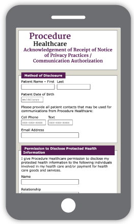
The same medical form, rebuilt and now responsive would look like this:
With responsive design, all the elements of the form will rearrange themselves to fit the patient’s viewport – without changing font sizes or field sizes – and eliminate the need to scroll left or right to see the entire image.
When you consider that your patients can complete the form and submit it right now, all from whatever device they choose, you can imagine how many more responses you’ll get that might have once never happened.